

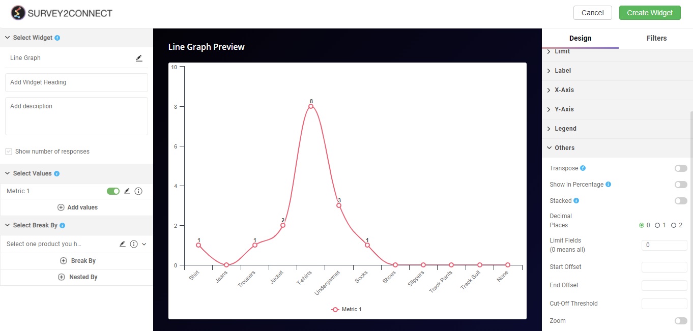
Line Graph

Views
A line graph is a type of chart used to show information that changes over time. It uses a linear line to showcase different data points across a two-axis graph. A line graph is best used to showcase trajectory over numerous individual data sets.
Use of Line Graph
Line graphs are used to track changes over short and long periods of time. When smaller changes exist, line graphs are better to use than bar graphs. When you have numerous data set across the chart, a line graph traces the data sets and creates a line through the data set to showcase a trajectory.
Let’s say you want to show a trajectory of month-on-month data for your NPS score or rating out of 100, you can use Line Graph to show you data sets across a two-axis chart.

There are numerous features available for you to customize your line graph.
The options available are:
Widget Heading: You can add a widget heading that would appear on top of the widget. You can also insert piping using the Break by data. You can also pipe filter in the widget heading that can be seen on the Dashboard page. The widget heading allows you to give viewers an idea of what the widget depicts.
Widget Description: You can add a widget description that would appear on top of the widget. This allows you to mention details about the widget. You can make changes to alignment, text color, text size with the options available. The customizable options are:
-
- Bold: This allows you to make your text bold
- Text size: You can change the size of the text using this option
- Text Color: You can manage the color of the text from this option.
- Alignment: This option allows you to choose between three alignment options — Left, center and right.
- Insert Piping: This option lets you pipe information. The available options are total, month, widget-time-filter and global-time-filter. The total shows you the total count of the responses, month shows you the month of widget creation, widget time filter shows you the time as per the widget.
Show Number of Response: When enabled, this option would allow you to show the total number of responses on the top left side of the widget.
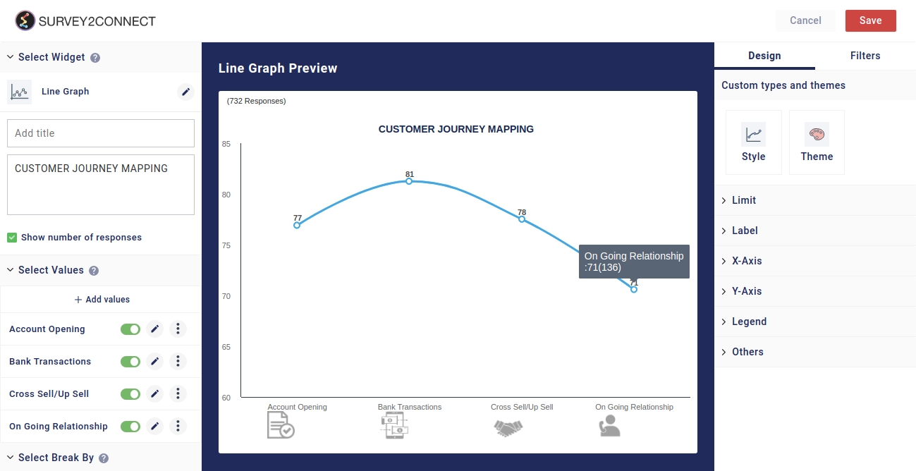
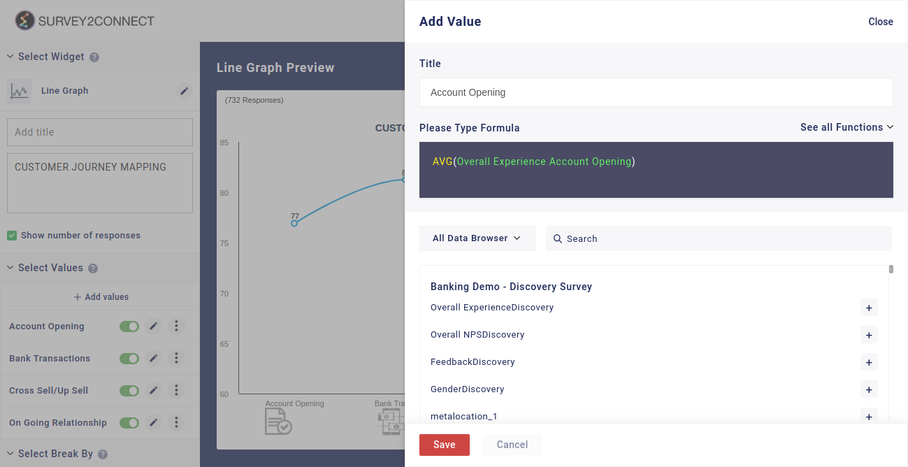
Select Value: This option lets you select the value for the graph. You can add multiple values to your graph. Users can select the question and function in this option:
-
- Function: This option lets you select the function, which acts as a mathematical equation for the data available. You can select from the options available.
- Data Browser: This option lets you select the question whose data would be used in the graph.
Sub-option of Select Value: There are minor customization options available under each Metric that you have added.
- Change Color: This option lets you change the color of the data point for the particular metric
- Rename: This option lets you rename the Metric
- Duplicate: This option lets you duplicate the metric
- Delete: This option lets you delete the particular metric.
Select Break By:Break by feature allows you to break your singular data into multiple sets. When you select a metric via Select Values, it creates the metric as a single unit depending upon the function you have used in the process. However, if you wish to break the data into individual variables or break the data as per certain variables, you can use Break By functions. It allows you to classify your data as per selected variables. Read more about Break By here.
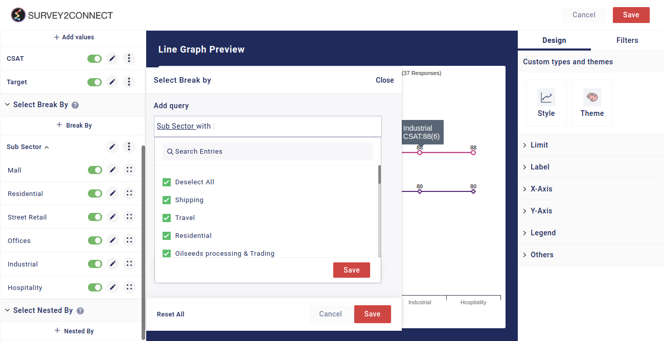
Select Nested By: Once you have applied Break By on Metric Data, you can perform further classification of the data using Nested By. While Break By data breaks the Metric Data, you can further break into individual segments using Nested By. Click here to read more.
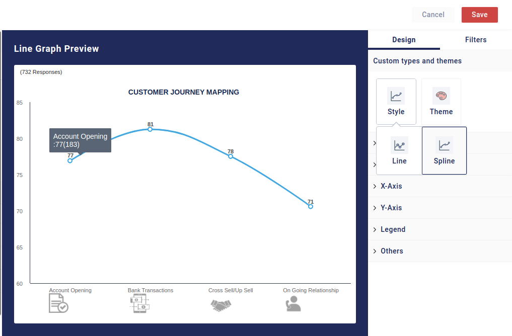
Designs: This option lets you manage the design of the Line Graph. You can change the graph type, style, and design.
-
- Style: In this, you can toggle between different types of styles available. The two available options are line and spline. The difference between them is that while line refers to a graph with straight lines and sharp edges, spline has slight curves at edges when tracing the data on a graph. Below is an example of a spline type of Line Graph.
-
- Theme: You can toggle between different themes using this option.
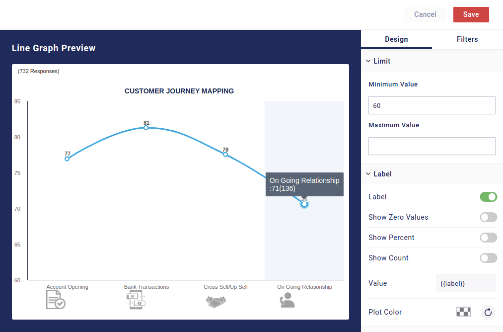
Limit: With this, you can set the limit of the number shown on the Y-axis. The minimum value lets you set the minimum value for the data on the Y-axis whereas the Maximum lets you set the maximum value.
Label:With this, you can manage the label of the data fields. These options help you customize the information shown regarding the data in the widget.
- Show Zero Value: This option lets you show answer choices with values as zero. Usually, such data sets are hidden but if you wish to show zero value data sets on your graph, you can enable it from here.
- Show Percent: When enabled, this would show the data sets in percentage.
- Show Count: When enabled, this would show the count data for each data set.
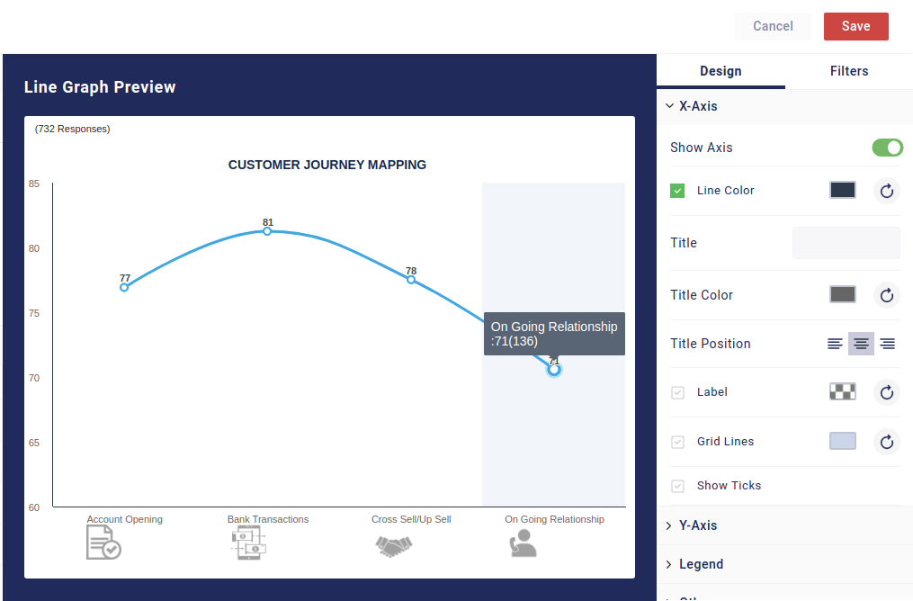
X-Axis: This option lets you manage the design for the X-axis
-
- Show Axis: This option lets you disable and enable the X-axis line
- Line Color: This option lets you change the color of the X-axis line, making it customizable as per your design.
- Title: Using this option you can give the name to the Axis. This helps in making it clear what the particular axis signifies.
- Title Color: This option lets you change the color of the title of the X-axis
- Title Position: You can toggle between the left, center, and right positions for the title.
- Label: Label shows you the details of the data sets on the X-axis. You can enable it to be shown while disabling it would hide the Labels for the X-axis.
- Show Ticks: Ticks are the separator between two data points on the axis. You can enable or disable this using the option
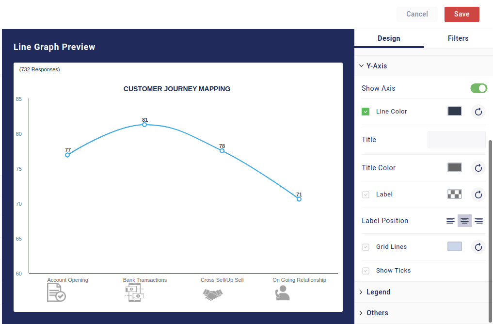
Y-Axis: This option lets you manage the design for the Y-Axis
-
- Show Axis: This option lets you disable and enable the Y-axis line
- Line Color: This option lets you change the color of the Y-axis line, making it more adaptive to your design needs
- Title: Using this option you can give the name to the Axis, making it more clear what the particular axis signifies
- Title Color: Using this option, you can change the color of the title
- Label: Label shows you the details of the data sets on the Y-axis. You can choose to show the details by enabling it and hide it by disabling it.
- Label Position: This option lets you manage the position of the label.
- Grid Lines: This option lets you have a line between two points with respect to the Y-axis. This allows you to measure your data across the coordinates easily.
- Show Ticks: Ticks are the separator between two data points on the axis. You can enable or disable this using the option
Show Legend: Legend refers to the metric details shown with the bar which indicate what the individual bar represents. For example, if you have Yes and No as two options, the legend is the detail that shows Yes and No and their respective color. You can toggle between four positions available — Top, Bottom, Left, and Right.
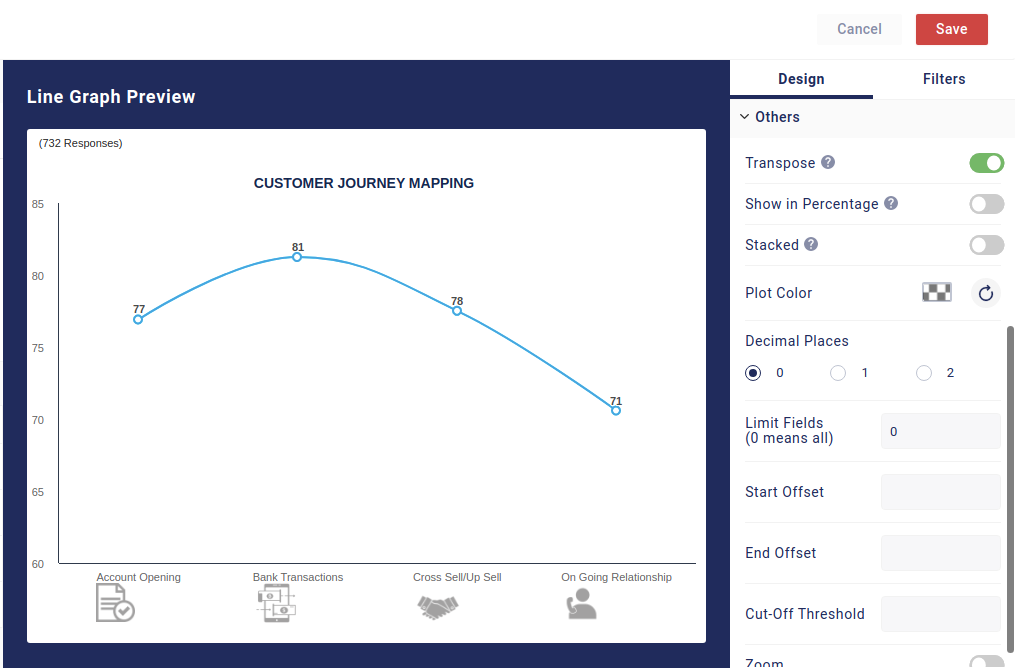
Others: There are other options available that can be customized.
-
- Transpose: With this, you can alter the data shown in your widget. Transpose means to change the order. If you have only Break by applied and you apply transpose, your data would become one metric, stacked on top of each other. If you have Break By and Nested By both applied, the data would change its order. Your Break By data would be replaced with Nested By and vice versa.
- Show in Percentage: When enabled, you see the data in percentage form. This option is useful when you want a percentage representation of the data.
- Decimal Places: You can select how many decimal places will be shown in the data
- Limit Fields: This option lets you limit how many fields would be shown in the graph. Zero would mean all the fields.
- Start Offset: The number you select here would be the number of data points removed from the X-axis. If you select 2 then two data points would be removed from the start.
- End Offset: This works similarly to the previous option. The only difference is that the number you select here would be reflected in the data points being removed from the right side of the X-axis. If you select 2, two data points from the end would be removed.
- Cut-Off Threshold: This allows you to set a threshold for the data on the Y-axis. The data point with data that crosses the threshold would be shown and the ones below that won’t be shown.
 English
  Arabic