

Donut Chart

Views
The donut chart is a circular statistical graphic, similar to the pie chart. It is divided into slices to show the numerical proportion of all the answer choices. With Survey2Connect, you get multiple designs, themes, and styles for the Donut chart widget.
Use of Donut Chart
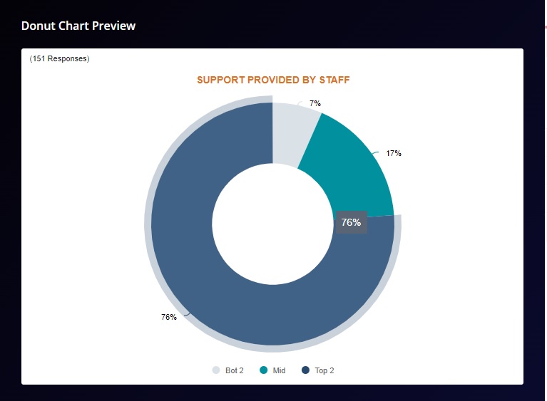
Donut charts are used to show the proportions of categorical data, with the size of each piece representing the proportion of each category. The donut chart is pretty similar to the pie chart, except in the Donut chart the center portion of the circle is hollow.
The individual slice in the donut chart signifies the proportion of the individual data set stacked against the whole(100%). For example, if you have a question asking for feedback about the support provided by staff and you have three answer choices — Top 2, Mid, and Bottom 2, you can use a donut chart to showcase your data as to how each option is in proportion to the whole.
The options available are:
Widget Heading: You can add a widget heading that would appear on top of the widget. You can also insert piping using the Break by data. You can also pipe filter in the widget heading that can be seen on the Dashboard page. The widget heading allows you to give viewers an idea of what the widget depicts.
Widget Description: You can add a widget description that would appear on top of the widget. This allows you to mention details about the widget. You can make changes to alignment, text color, text size with the options available.
The customizable options are:
-
- Bold: This allows you to make your text bold
- Text size: You can change the size of the text using this option
- Text Color: You can manage the color of the text from this option.
- Alignment: This option allows you to choose between three alignment options — Left, center and right.
- Insert Piping: This option lets you pipe information. The available options are total, month, widget-time-filter, and global-time-filter. The total shows you the total count of the responses, month shows you the month of widget creation, widget time filter shows you the time as per the widget.
Show Number of Response: When enabled, this option would allow you to show the total number of responses on the top left side of the widget.

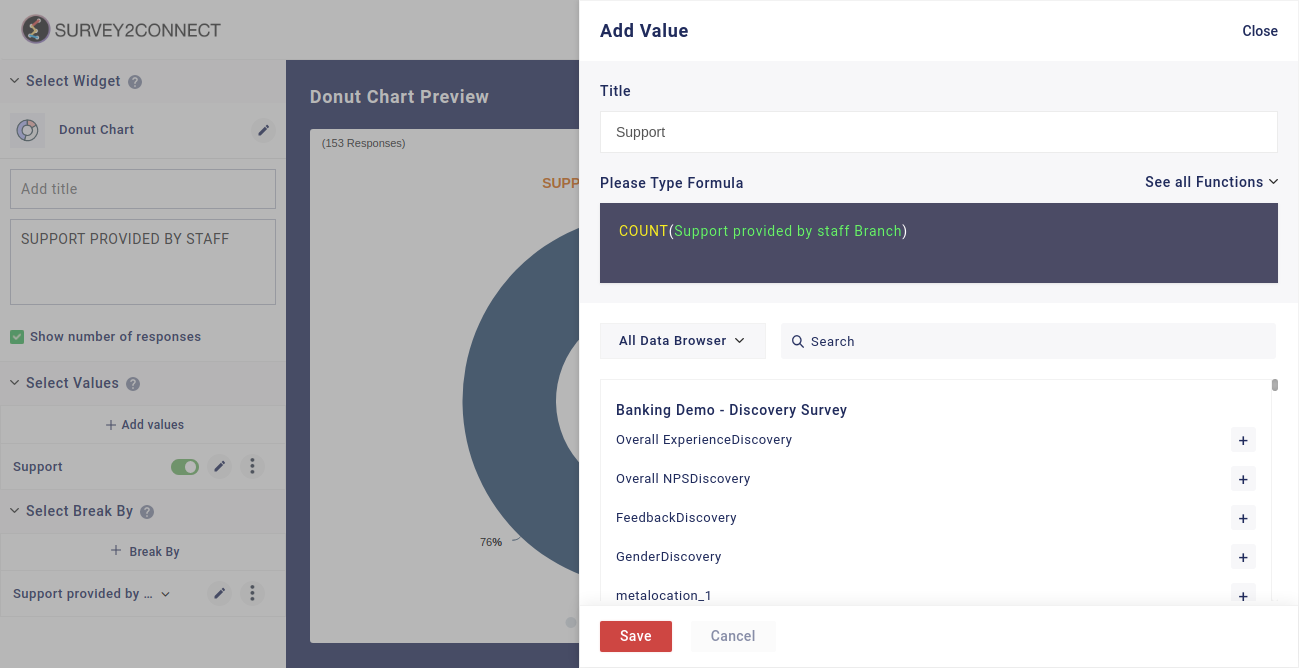
Select Value: This option lets you select the value for the chart. You can add multiple values to your chart. Users can select the question and function in this option:
-
- Function: This option lets you select the function, which acts as a mathematical equation for the data available. You can select from the options available.
- Data Browser: This option lets you select the question whose data would be used in the chart.
 Sub-option of Select Value: There are minor customization options available under each Metric that you have added.
- Rename: This option lets you rename the Metric
- Duplicate: This option lets you duplicate the metric
- Delete: This option lets you delete the particular metric.
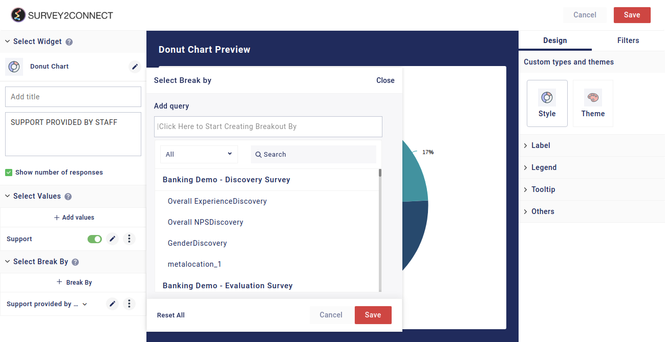
Select Break By: Break by feature allows you to break your singular data into multiple sets. Using the break by function, you can break the data into individual subsets. With this option, you can select the question on the basis of which the Break by would be applied for the data set. Click here to read more.
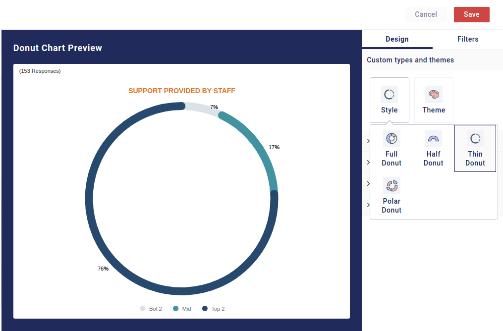
Designs: This option lets you manage the design of the Donut Chart. You can change the chart type, style and design.
-
- Style: This lets you change the style of the donut chart. You can toggle between Full donut, half donut, thin donut and polar donut.
- Theme: You can toggle between different themes using this option. There are a total of 6 theme options available, including the default theme.
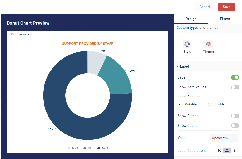
Label: With this, you can manage the label of the data fields. These options help you customize the information shown regarding the data in the widget.
-
- Show Zero Value: This option allows you to display the answer choices with values as zero. For example, if you have a data field that has its value as zero, it is usually not shown in the widget. But with this option enabled, it would be shown to you in the widget.
- Label Positions: This option allows you to change the position of labels. You can either place them in a circle or outside.
- Show Percent: With this function enabled, you would be able to view the data of the individual slice in terms of percentage.
- Show Count: With this, you would be able to view the count data of individual slices.
- Label Decorations: With this, you can manage the look of labels. You can make your text Bold, Center aligned, and Italic.
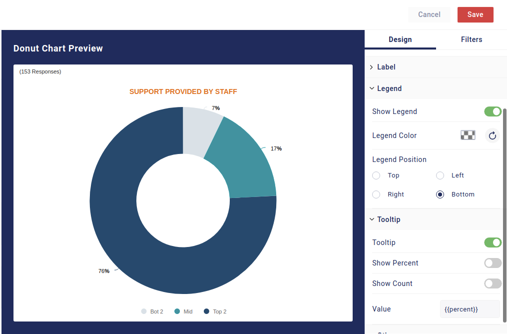
Show Legend: Legend refers to the metric details shown with the bar which indicate what the individual bar represents. For example, if you have Yes and No as two options, the legend is the detail that shows Yes and No and their respective color. You can toggle between four positions available — Top, Bottom, Left, and Right.
Tooltip: Tooltip refers to the information shown when you hover the cursor over the Donut. There are further options available that can be enabled.
-
- Tooltip: You can enable or disable it with the button
- Show Percentage: You can enable the percentage view when you drag the cursor on the Donut
- Show Count: You can enable the count view when you drag the cursor on the Donut
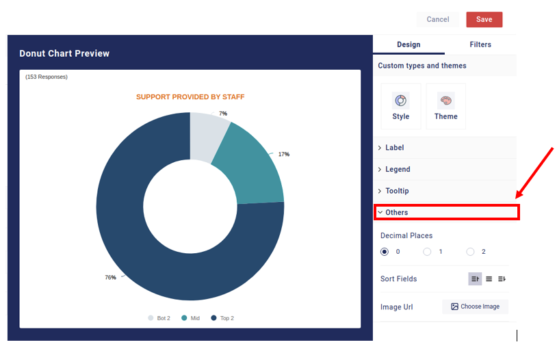
Others: There are other options available that can be customized.
-
- Decimal Places: You can select how many decimal places will be shown in the data
- Sort Fields: You can sort the fields in the widget with respect to their order of appearance. You have the option of ascending, descending, and no sorting.
 English
  Arabic