

Bar Chart Widget

Views
A bar chart is used to presents categorical data with rectangular bars with heights or lengths proportional to the values that they represent. One axis in the chart shows the category or numerous fields and the other axis represents numerical data.
Use of Bar Chart
A bar chart is used when you want to show a distribution of data points or perform a comparison of metric values across different subgroups of your data. From a bar chart, we can see which groups are highest or most common, and how other groups compare against the others.
In the dashboard, you use Bar Chart to show the case and compare two individual data set. For example, if you had a question, “What were the negatives you faced with us?” and you have 5 options choice, you can use Bar Chart to see how individual options stack against each other to find your best-performing item.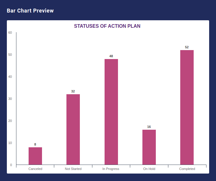
With Survey2Connect, you get multiple designs, themes, and styles for the bar chart widget.
The options available are:
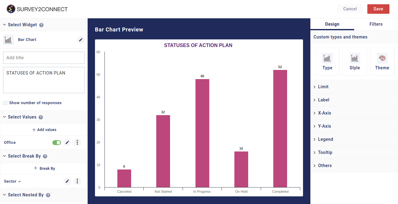
Widget Heading: You can add a widget heading that would appear on top of the widget. You can also insert piping using the Break by data. You can also pipe filter in the widget heading that can be seen on the Dashboard page. The widget heading allows you to give viewers an idea of what the widget depicts.
Widget Description: You can add a widget description that would appear on top of the widget. This allows you to mention details about the widget. You can make changes to alignment, text color, text size with the options available. The customizable options are:
-
- Bold: This allows you to make your text bold
- Text size: You can change the size of the text using this option
- Text Color: You can manage the color of the text from this option.
- Alignment: This option allows you to choose between three alignment options — Left, center and right.
- Insert Piping: This option lets you pipe information. The available options are total, month, widget-time-filter and global-time-filter. The total shows you the total count of the responses, month shows you the month of widget creation, widget time filter shows you the time as per the widget.
Show Number of Response: When enabled, this option would allow you to show the total number of responses on the top left side of the widget.
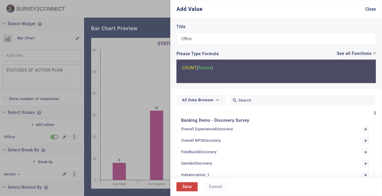
Select Value: This option lets you select the value for the chart. You can add multiple values to your chart. Users can select the question and function in this option:
-
- Function: This option lets you select the function, which acts as a mathematical equation for the data available. You can select from the options available.
- Data Browser: This option lets you select the question whose data would be used in the chart.
Sub-option of Select Value: There are minor customization options available under each Metric that you have added.
- Change Color: This option lets you change color of the data point for the particular metric
- Rename: This option lets you rename the Metric
- Duplicate: This option lets you duplicate the metric
- Change Chart Type: This option is available under the Bar Chart that lets you change the chart type. The available options are Column, Spline, Line and Area. This feature is useful when you wish to add more than one metric in the widget and want each metric to be represented uniquely.
- Delete: This option lets you delete the particular metric.
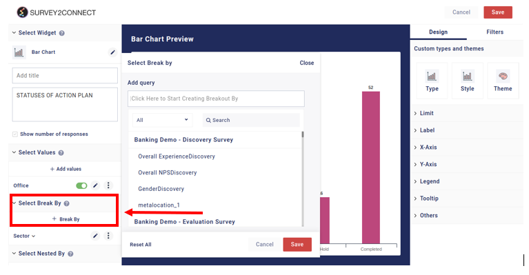
Select Break By: Break by feature allows you to break your singular data into multiple sets. Using the break by function, you can break the data into individual subsets based on your choice. With this option, you can select the question on the basis of which the Break by would be applied for the data set. Read more, here.
Nested By: Once you Break By the data, you can use the Nested By feature to further classify data into smaller subsets. Click here to read more
Designs: This option lets you manage the design of the Bar Chart. With Survey2Connect, you have the option to customize the designs of the widget. You can change the chart type, style, and design.
- Type: This option lets you change the chart type. The available options are —

-
- Verticle — This is the default design of the widget with the verticle stripes depicting the data
- Vertically Stacked — It is similar to the Verticle design with the only difference being that when you apply the nested by, the data for a single Break by field would be stacked on top of each other while in the Verticle one, each nested by data would be adjacent to each other.
- 100% Vertically Stacked — With this design, all the bars would be stacked to 100%, meaning that all the bars would be at the maximum height despite the count difference.
- Horizontal — This design allows you to make the bars horizontal, also switching the fields for both the X and Y Axes.
- Horizontal Stacked — This is similar to the Horizontal design with the only difference being that when you apply the nested by, the data would be stacked in the bars while in the Horizontal one, they would be placed next to each other.
- 100% Horizontal Stacked — With this design, all the bars would be stacked to 100%, meaning that all the bars would be at the maximum height despite the count difference.
- Style: This option allows you to customize the style of the bars. You can toggle between a thick bar or a thin bar.
- Theme: You can toggle between different themes using this option. You have a total of 6 available options, each changing the color of the bars.

Limit: With this, you can set the limit of the number shown on the Y-axis. The minimum value lets you set the minimum value for the data on the Y-axis whereas the Maximum lets you set the maximum value.

Label: With this, you can manage the label of the data fields. These options help you customize the information shown regarding the data in the widget.
- Show Percent: When enabled, this would show the data in percentage. For example, if you have selected Count as the function and have two options with each having 100 as count, the data would be shown as 50% for each bar.
- Show Count: When enabled, this would show the count data of each bar. This would show how many responses have the selected answer choice in them.
- Stack Percentage: This option lets you stack the percentage for each break by data. This option is used when you are using Stack design for the bar chart. In such a case, you would be able to see the percentage of each stack data with respect to the entire bar.
- Show Base: This shows you the base data for each bar. In the case of the widget, the base data would be the total responses in the value field.
X-Axis: This option lets you manage the design for the X-axis.

-
- Show Axis: This option lets you disable and enable the X-axis line
- Show Zero values: This option when enabled also shows you the data set with their values as zero. For example, if you have any answer choice with zero selection, this option would show that answer choice on the graph too.
- Line Color: This option lets you change the color of the X-axis line.
- Title: Using this option you can give the name to the Axis. This allows you to properly mark what the axis signifies.
- Title Position: This option lets you decide where the title would be positioned on the widget. You can toggle between the left, center, and right positions for the title.
- Label: Label shows you the details of the data sets on the X-axis. These labels show what these individual bars signify.
- Label Font Size: This option lets you change the size of the fonts of Label.
- Multi-line label: You can have labels in multiple lines using this option. This option is used when your labels have too many characters and it is being overlapped by the adjacent label. You can use this feature to show you labels in multiple lines.
- Label Position: This option lets you manage the position of the label.
- Grid Lines: This option lets you have a line between two bars. This acts as a seperator for two data sets.
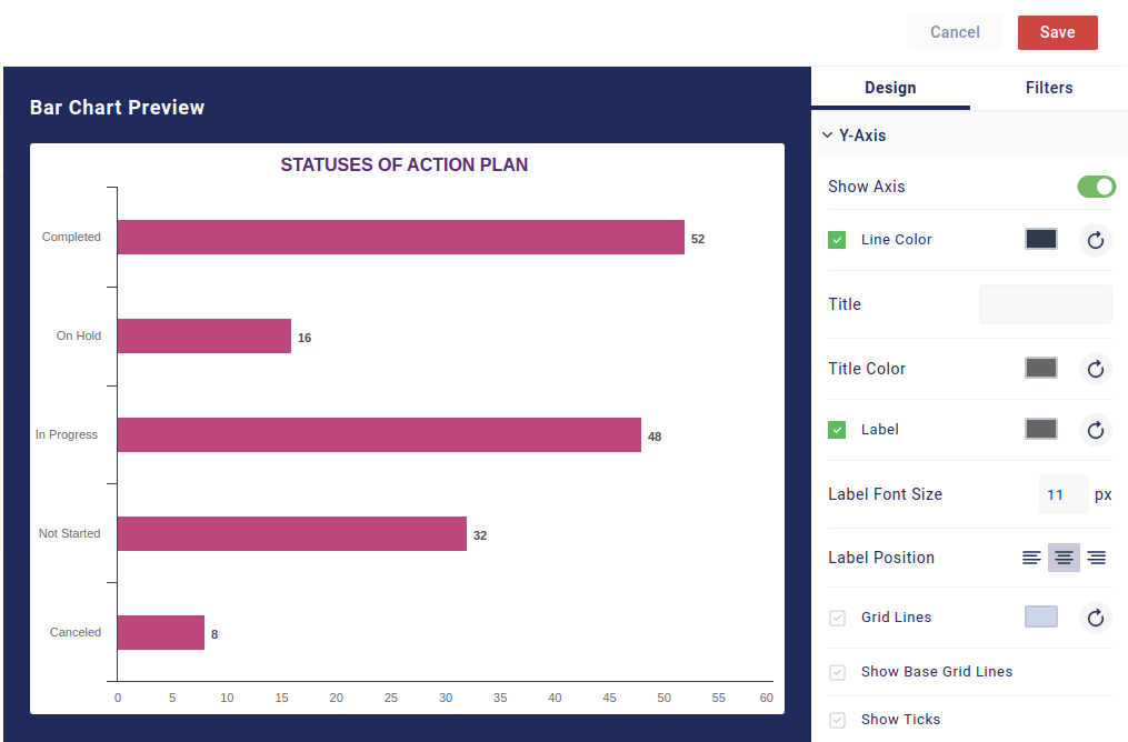
Y-Axis: This option lets you manage the design for the Y-Axis
-
- Show Axis: This option lets you disable and enable the Y-axis line. When enabled it would show the Y-axis
- Line Color: This option lets you change the color of the Y-axis line
- Title: Using this option you can give the name to the Axis. This helps signify what the Y-axis in the widget means
- Title Color: Using this option, you can change the color of the title. This allows you to customize your visual for the widget.
- Label: Label shows you the details of the data sets on the Y-axis. You can enable the option to display or hide the labels on the Y-axis using this button.
- Label Font Size: This option lets you change the size of the fonts of Label as per your need.
- Label Position: This option lets you manage the position of the label. The available options are left aligned, centre aligned or right side aligned.
- Grid Lines: This option lets you have a line between two data sets. For example, if your Y-axis has 0 to 10 as their labels, this option would create a grid line for every number, making it easy to comprehend your bar’s data in relation to Y-axis.
- Show Base Grid Lines: This option lets you enable the base grid lines.
Show Legend: Legend refers to the metric details shown with the bar which indicate what the individual bar represents. For example, if you have Yes and No as two options, the legend is the detail which shows Yes and No and their respective color. You can toggle between four positions available — Top, Bottom, Left, and Right.
Tooltip: Tooltip refers to the information shown when you hover the cursor over the bar. There are further options available that can be enabled.
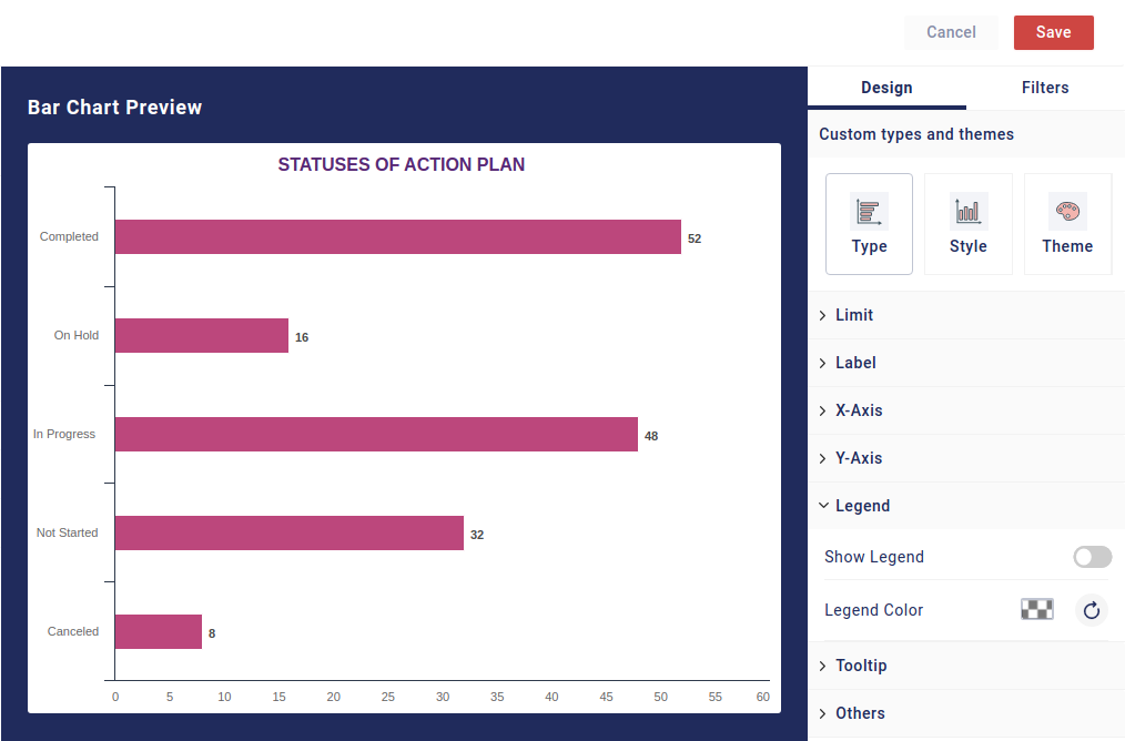
-
- Tooltip: You can enable or disable it with the button
- Show Percentage: You can enable this option which would allow you to see the data of the particular bar in percentage when you hover over it.
- Show Count: With this option enabled, you can see the count of the data in a particular bar when you hover over it.
- Show Base: You can use this option to show base data in the bars. In the default case, it would be total responses included in the value field.
- Stack Percentage: This option is used to show the stack percentage in each bar. This option is best used with vertically stacked or horizontally stacked.
Others: There are other options available that can be customized.
-
- Transpose: With this, you can alter the data shown in your widget. Transpose means to change the order. If you have only Break by applied and you apply transpose, your data would become as one metric, stacked on top of each other. If you have Break By and Nested By both applied, the data would change its order. Your Break By data would be replaced with Nested By and vice versa. Below is an example of Transposed data with just only Break-By applied in the value. Both the options are stacked on top of each other. To create this type of stack, you need to have Vertically Stacked as your Chart Type
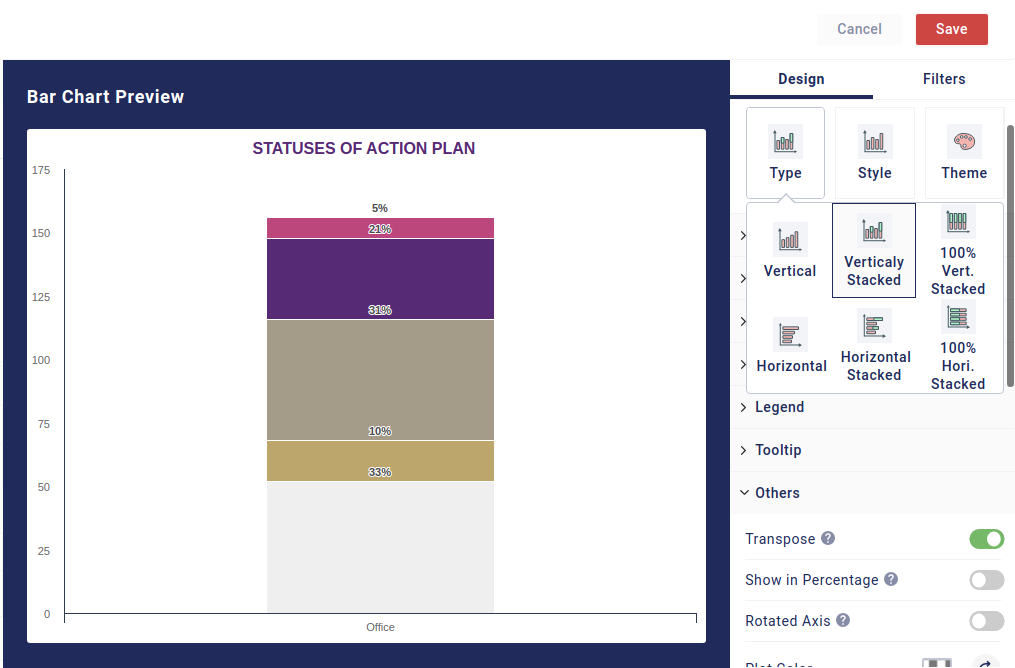
- Show in Percentage: When enabled, you see the data in percentage form. This option is useful when you want a percentage representation of the data.
- Rotated Axis: You can interchange both axes with this button. Once you use this, your X-axis becomes Y-axis and vice-versa.
- Decimal Places: You can select how many decimal places will be shown in the data
- Sort Fields: You can sort the fields in the widget in terms of the order in which they would appear. You have the option of ascending, descending, and no sorting.
- Limit Fields: This option lets you limit how many fields would be shown in the graph. Zero would mean all the fields.
- Start Offset: The number you select here would be the number of bars removed from the X-axis. If you select 2, 2 bars would be removed from the start.
- End Offset: This works similarly to the previous option. The only difference is that the number you select here would be reflected in the bars being removed from the right side of the X-axis. If you select 2, two bars from the end would be removed.
- Cut-Off Threshold: This allows you to set a threshold for the data on the Y-axis. The bar with data that crosses the threshold would be shown and the ones below that won’t be shown.
- Minimum Responses: This option allows you to set the minimum response and any bar with fewer data won’t be reflected
- Club Options: This option allows you to club all the answer choices under a single bar
- Hide in Mobile View: This option hides the widget in the Mobile view
 English
  Arabic