

Customize Analysis Display

Views
Customize Analysis Data is used to change the display of data for each question. You can select from Chart Type, Display options, Colors, and Labels. You can also change the appearance of a particular Chart type using the customize option. The steps to customizing analysis data are as follows:
Customization options available
Chart Type: This option allows you to change the chart type of the particular question summary. For example, if you have a bar chart as default, you can change it to a pie chart or horizontal bar graph. Depending upon the question type, you are provided with 8 types — Horizontal Bar Graph, Verticle Bar Graph, Horizontal Stacked Bar Graph, Verticle Stacked Bar Graph, Pie Chart, Donut Chart, Line Graph, and Area Graph.
Display Options: You can optimize the display of the chart by managing Axis Scale and Decimal places. The available options are
- Chart: Using this option you can show or hide the chart in the question summary.
- Data Table: This option lets you show or hide the table showing the data below the chart.
- Axis Scale: This option lets you toggle between the percentage of Absolute as your scale for the chart. If you choose percentage, the axis data would be shown in percentage but if you choose absolute, your data would be shown in absolute numbers.
- Decimal Places: This option lets you decide the number of zeroes allowed after the decimal.
Colors: This option lets you change the color of individual answer choices which will help you identify them easily on the chart.
Labels: The answer choices are marked with a label, which indicates the individual answer choices. You can change the label from here. For example, if you have Yes and No as two answer choices, their labels would Yes and No, respectively. You can change the label. There is also an option of revert, which will take you back to the Original label.
1. Go to the Question Summary section of the Analyse Result
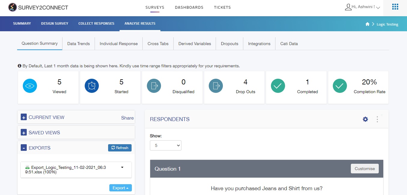
2. Click on Customise on the right side of the question
3. Select Chart Type and manage the Display option
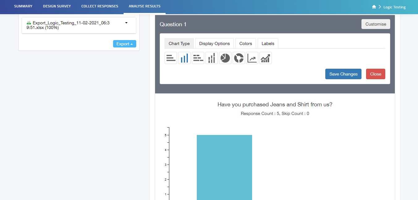
4. Click Save
5. Repeat the same process for other questions
Note: There are different Customize Analysis Data options for different types of questions. The above-mentioned customisations are an example of the Single Choice Question type.