
Simple Table

Views
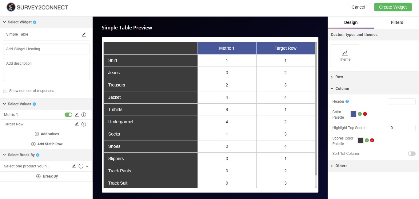
The simple table widget allows you to create a table as a widget. You can customize the table to create complex matrices, add multiple value, columns and rows to depict your survey data in a tabular manner.
Use of Simple Table
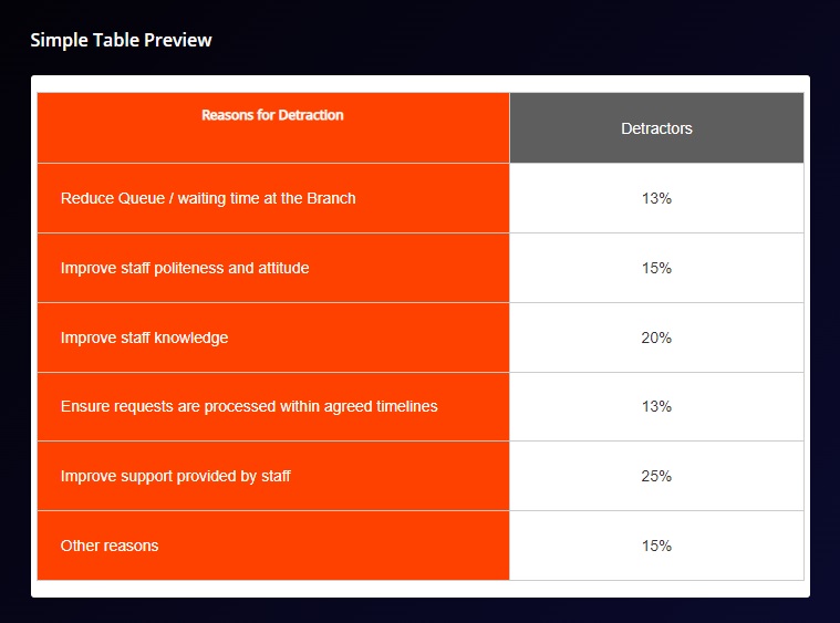
The primary use of a Simple table is to showcase informative data in tabular format. In this, you can have a static row displaying the information heading and a second-row showing the value. Below is an example of a Simple table showing the data about detractors and reasons why they are leaving and how much the individual reason consists of when compared to whole(100%)
You can customize the widget with these available options:
Widget Heading: You can add a widget heading that would appear on top of the widget. You can also insert piping using the Break by data. The widget heading allows you to give viewers an idea of what the widget depicts.
Widget Description: You can add a widget description that would appear on top of the widget. This allows you to mention details about the widget. You can make changes to alignment, text color, text size with the options available. You can also insert piping using the Break by data. The customizable options are:
-
- Bold: This allows you to make your text bold
- Text size: You can change the size of the text using this option
- Text Color: You can manage the color of the text from this option.
- Alignment: This option allows you to choose between three alignment options — Left, center and right.
- Insert Piping: This option lets you pipe information. The available options are total, month, widget-time-filter and global-time-filter. The total shows you the total count of the responses, month shows you the month of widget creation, widget time filter shows you the time as per the widget.
Show Number of Response: When enabled, this option would allow you to show the total number of responses on the top left side of the widget.
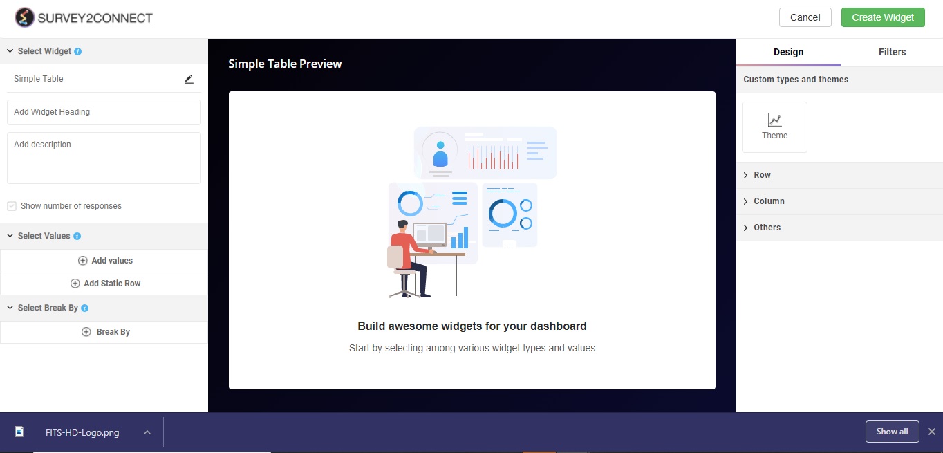
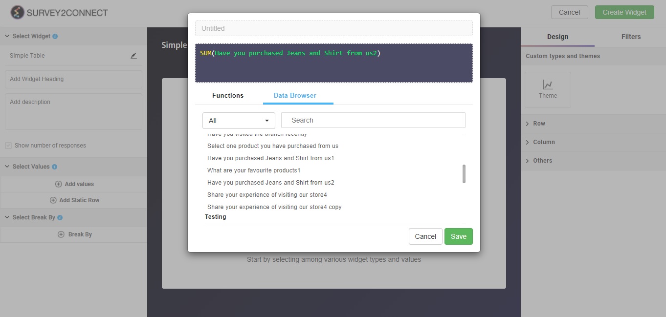
Select Value: This option lets you select the value for the chart. You can add multiple values to your chart. Users can select the question and function in this option:
-
- Function: This option lets you select the function, which acts as a mathematical equation for the data available. You can select from the options available.
- Data Browser: This option lets you select the question whose data would be used in the chart.
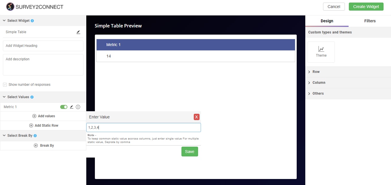
Add Static Row: This option allows you to add a static row that can have one or more predefined values. Click on the button and add the number you wish to add to the row. You can separate the number for each row with a comma.
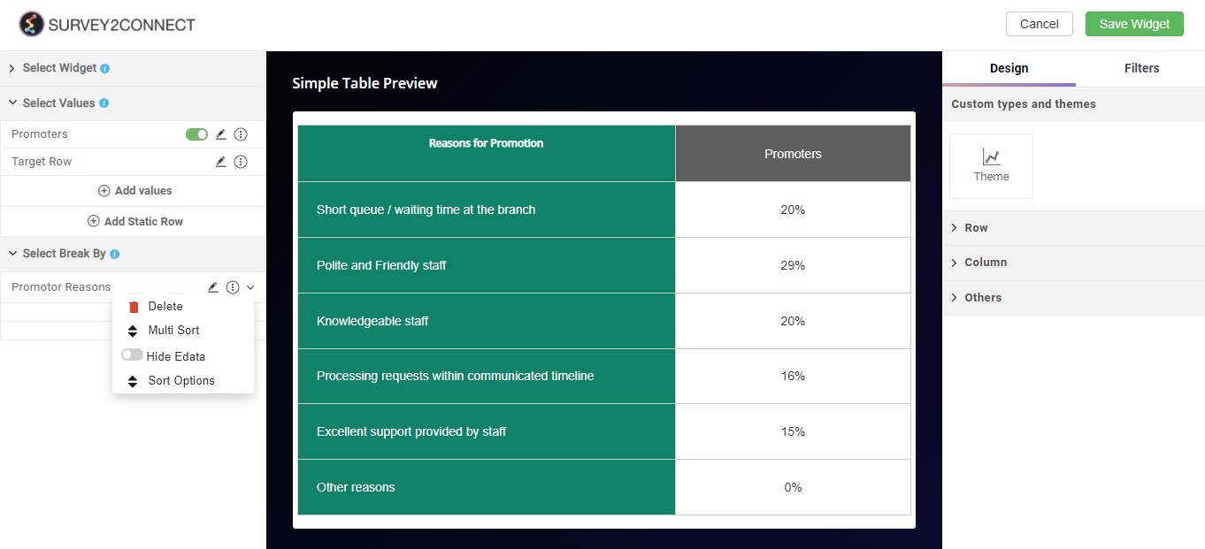
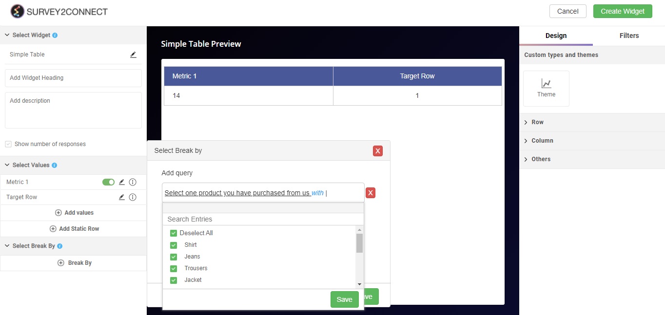
Select Break By: Break by feature allows you to break your singular data into multiple sets. Using the break by function, you can break the data into individual subsets based on your choice. With this option, you can select the question on the basis of which the Break by would be applied for the data set. Read more, here.
Designs: This option lets you manage the design of the Table. With Survey2Connect, you have the option to customize the designs of the widget.
-
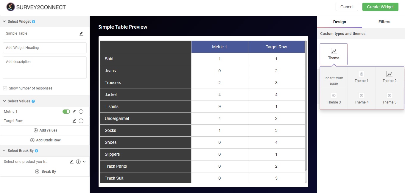
- Theme: You can toggle between different themes using this option. There are a total of 6 available options.
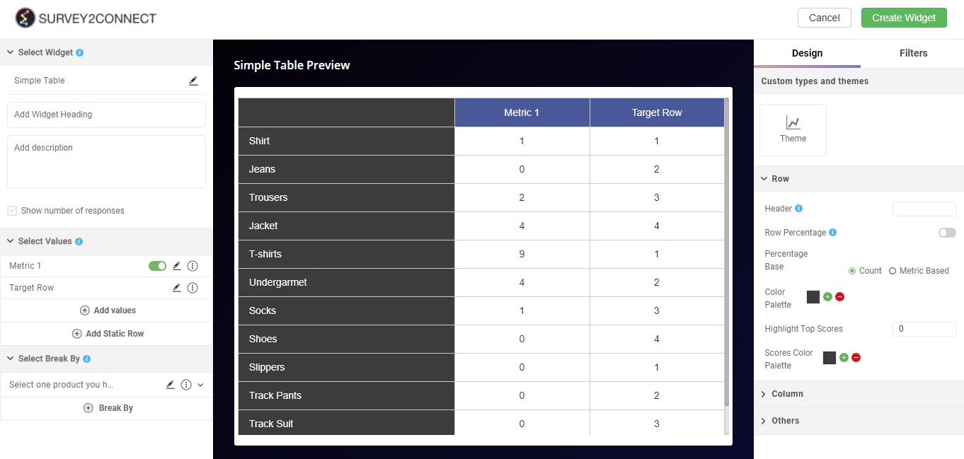
Row: This option lets you manage your rows in the table
-
- Header: This option lets you add a header for the top left section that houses data points. This would help you signify what the column stands for.
- Row Percentage: This option when enabled shows all the data in a percentage format. This includes the static row and the row with the data.
- Percentage Base: This option allows you to toggle between count and metric-based.
- Color Palette: This option lets you change the color of the row as per your design need.
- Highlight Top Score: This option when enabled, allows you to show the top score in the value row/s. You can add the number of top scores show by changing the number. So if you have set the number at two, it would highlight the top two scorers for each column.
- Scores Color Palette: This option lets you change the color for the top scores shown. Click on the plus sign to assign different colors to different scores.
Columns: This lets you customize the columns in your chart
-
- Header: This option lets you change the header for your column
- Color Palette: This option lets you change the color of your column
- Highlight Top Score: This option when enabled, allows you to show the top score in the columns. You can add the number of top scores show by changing the number.
- Scores Color Palette: This option lets you change the color for the top scores shown. Click on the plus sign to assign different colors to different scores
Others: There are many other options available:
-
- Transpose: With this, you can alter the data shown in your widget. Transpose means to change the order. If you have only Break by applied and you apply transpose, your data changes the position. Earlier what housed in the first row would be now in the first column and vice versa, changing the axis of both the field indicators. So, if your table was 4×5, it would now be 5×4.
- Hide left Title: This option lets you hide the left row completely.
- Decimal Places: You can select how many decimal places will be shown in the data.
- Highlight Negative Value: This option when enabled, allows you to highlight all the negative values in the table. You can change the color of the highlighter.
- Minimum Responses: This option allows you to set the minimum response and any bar with fewer data won’t be reflected.

Break By options
When applying a break by in the Simple Trends table, you get some options that are limited to the particular widget type. The two major options are
- Multi Sort: This option lets you change the sorting order of the matrix. You can create deeper levels and alter the sort order on the basis of your requirement.
- Hide Edata: Once you enable this option, it would hide the Embedded data in the table. This option is exclusive to Simple Table.