
Gauge Chart

Views
The gauge chart is similar to Pie Chart and Donut Chart. It uses a needle to indicate the data point. It shows the maximum, the minimum, and the present value of the data being analyzed. A gauge chart is a type of data visualization often used to display a single data value with a quantitative context. With a shape that resembles a speedometer, this chart aims to track the progress of a KPI.
Use of Gauge Chart
It is important to consider that this type of visualization is mostly used to display one single value. The popular use of this chart is for target metrics. Using them in this context will help you understand the performance of a specific KPI based on a target you pre-defined.
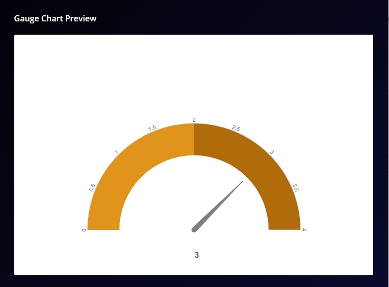
For example, if you wish to display the average rating given to you by your customers on a scale of 1-4, you can use a gauge chart to show the result.
There are many features available to customize the gauge chart widget in your dashboard.
The options available are:
Widget Heading: You can add a widget heading that would appear on top of the widget. You can also insert piping using the Break by data. The widget heading allows you to give viewers an idea of what the widget depicts.
Widget Description: You can add a widget description that would appear on top of the widget. This allows you to mention details about the widget. You can make changes to alignment, text color, text size with the options available. You can also insert piping using the Break by data. The customizable options are:
-
- Bold: This allows you to make your text bold
- Text size: You can change the size of the text using this option
- Text Color: You can manage the color of the text from this option.
- Alignment: This option allows you to choose between three alignment options — Left, center and right.
- Insert Piping: This option lets you pipe information. The available options are total, month, widget-time-filter and global-time-filter. The total shows you the total count of the responses, month shows you the month of widget creation, widget time filter shows you the time as per the widget.
Show Number of Response: When enabled, this option would allow you to show the total number of responses on the top left side of the widget.
Select Value: This option lets you select the value for the chart. You can add multiple values to your chart. Users can select the question and function in this option:
-
- Function: This option lets you select the function, which act as a mathematical equation for the data available. You can select from the options available.
- Data Browser: This option lets you select the question whose data would be used in the chart.
Select Comparison: This option when enabled, shows you the change in the data over a selected period. This option would be helpful in tracking the change of data over a period of time, hence giving us comparative data. However, the data shown in the comparison is depicted in percentage. So, if you witness a 20% change in data, it depicts that it has witnessed a change of 20% of the last data set.
Designs: This option lets you manage the design of the Bar Chart. With Survey2Connect, you have the option to customize the designs of the widget. You can change the chart type, style, and design.
-
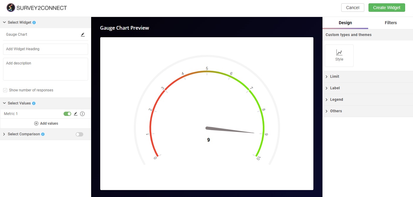
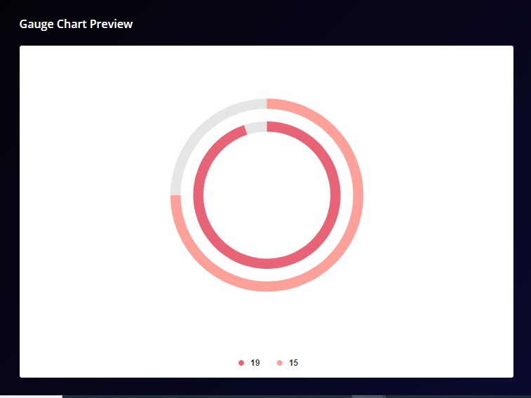
- Style: This option allows you to toggle between different style options of gauge chart available. There are a total of 5 gauge options available. This is a preview of a Multi Metric Gauge Chart. You can use this when you wish to make a gauge chart with multiple values.
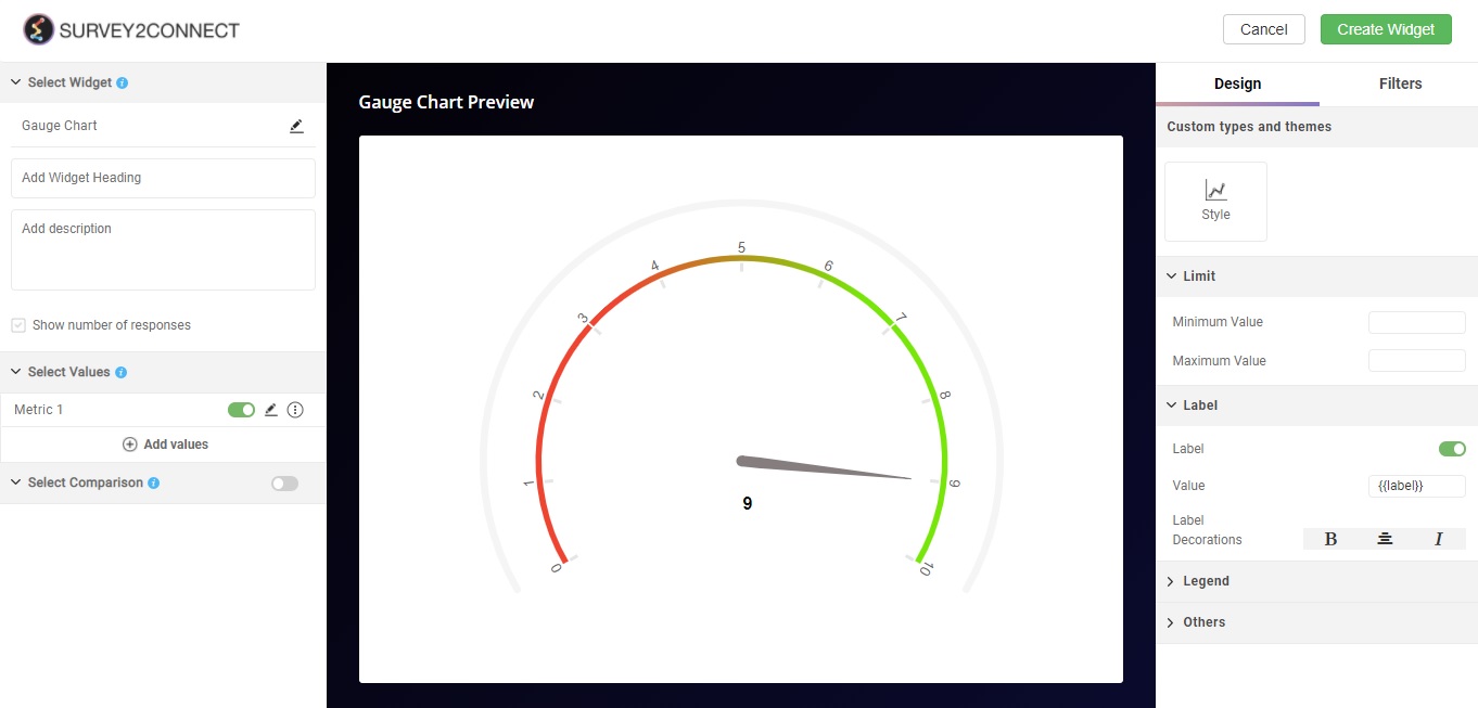
Limit: With this, you can set the limit of the gauge chart. You can set a maximum and minimum limit for the chart. This would determine the maximum and minimum value shown on the gauge.
Label:With this, you can manage the label of the data fields. These options help you customize the information shown regarding the data in the widget.
-
- Label Decorations: With this, you can manage the look of labels. You can make it bold, center-aligned and Italic
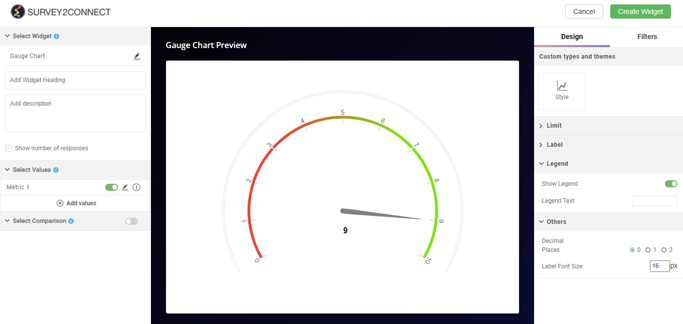
Legend:Legend refers to the metric details shown with the bar which indicate what the individual bar represents. For example, if you have Yes and No as two options, the legend is the detail which shows Yes and No and their respective color. You can toggle between four positions available — Top, Bottom, Left, and Right.
Others
-
- Decimal Places: This option lets you set the number of decimal places allowed in your data point.
- Label Font Size: This option lets you change the size of the label shown with the Gauge.
Speed Gauge 2 Chart
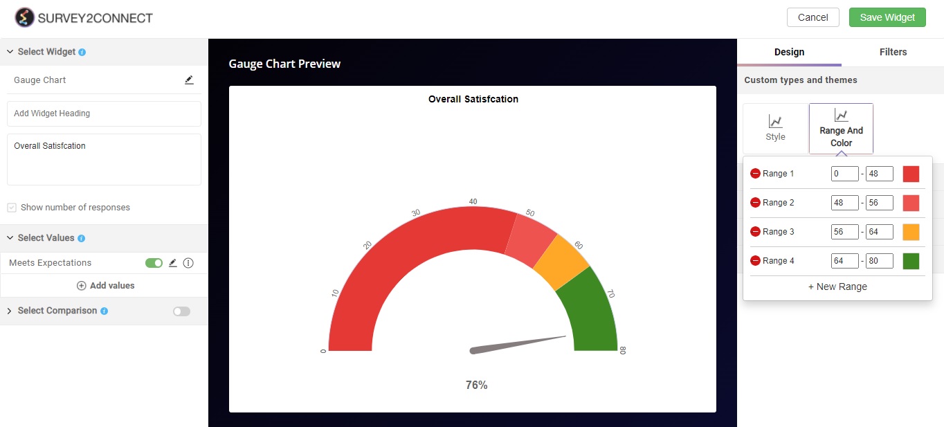
If you have selected Speed Gauge 2 from the Style option, you further get the option to customize the color and range. This option lets you customize the color for a separate range. You can change the range and it can be set with a negative value too.