

CSAT

Views
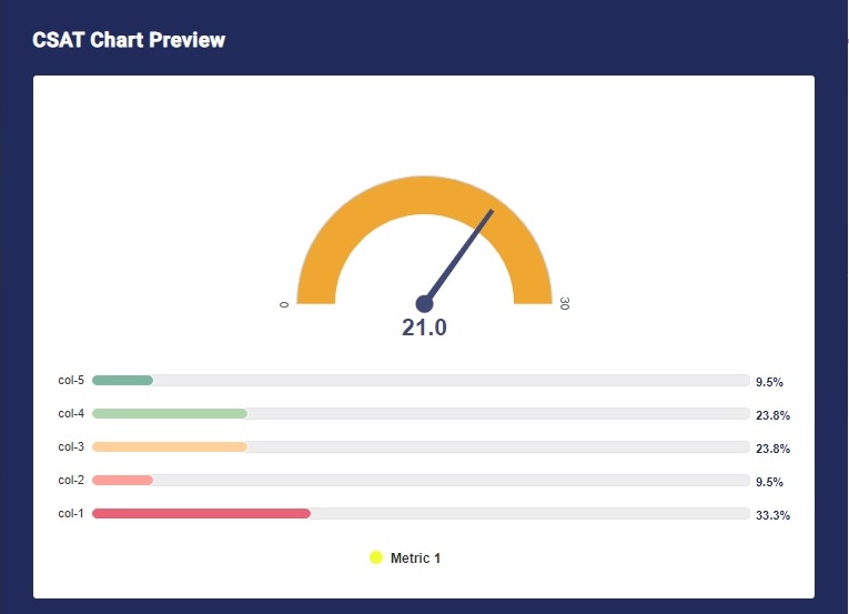
CSAT widget tells you about the customer satisfaction levels. This widget uses the data from your rating questions or graphical rating questions and depicts the data in terms of customer satisfaction level based on the rating your customers have given to you.
You can assign a Graphical rating question in the widget to get CSAT data. You have the option to either depict the data using a Gauge Chart or a horizontal or Numeric scale.
Use of CSAT Widget
CSAT widget is used when you want to measure the customer satisfaction level. Like you have a dedicated NPS question for the NPS widget, you can assign a graphical rating question for the CSAT widget. In the survey, you can ask your customers something like, “How satisfied are you with our service/product?” and you can ask them to rate on a scale of 1-5. With the help of the CSAT widget, you can calculate your CSAT score.
Features of CSAT Widget
The options available are:
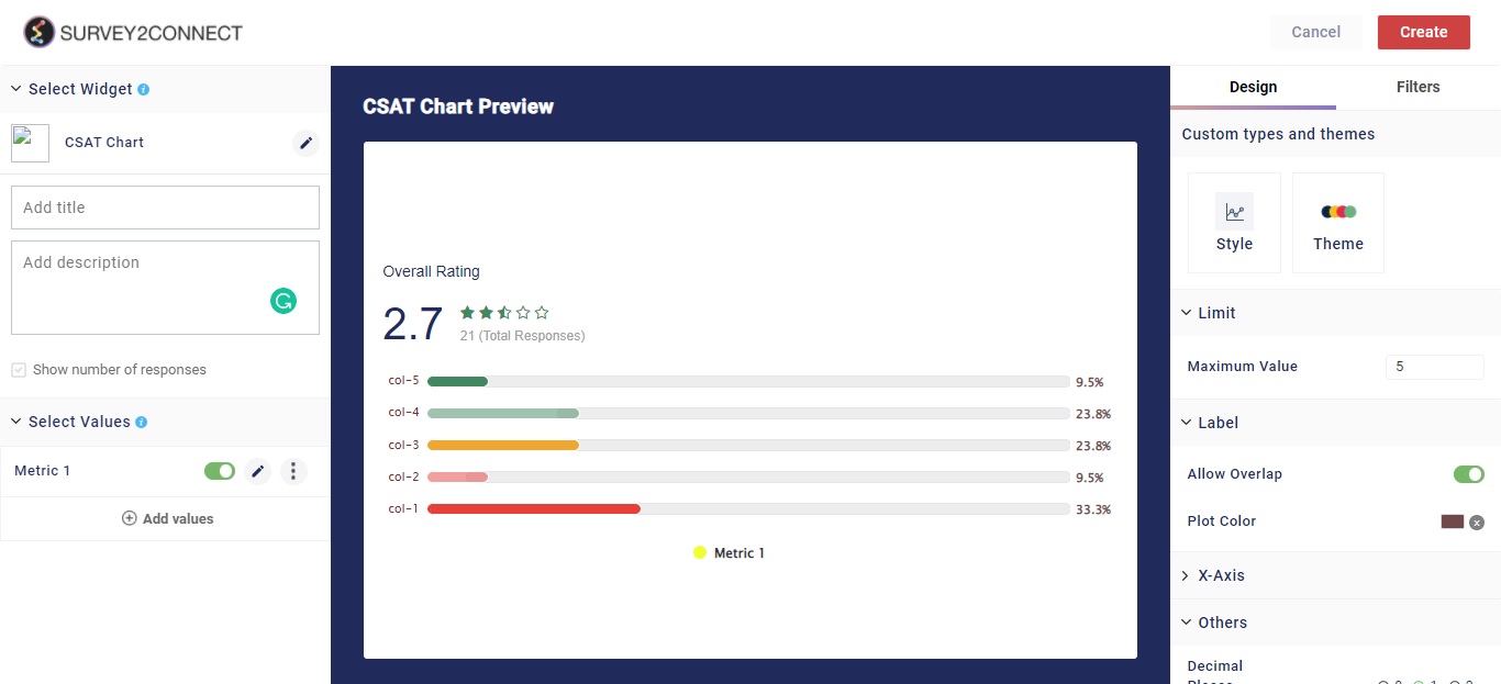
Widget Heading: You can add a widget heading that would appear on top of the widget. You can also insert piping using the Break by data. You can also pipe filter in the widget heading that can be seen on the Dashboard page. The widget heading allows you to give viewers an idea of what the widget depicts.
Widget Description: You can add a widget description that would appear on top of the widget. This allows you to mention details about the widget. You can make changes to alignment, text color, text size with the options available. The customizable options are:
-
- Bold: This allows you to make your text bold
- Text size: You can change the size of the text using this option
- Text Color: You can manage the color of the text from this option.
- Alignment: This option allows you to choose between three alignment options — Left, center and right.
- Insert Piping: This option lets you pipe information. The available options are total, month, widget-time-filter, and global-time-filter. The total shows you the total count of the responses, the month shows you the month of widget creation, widget time filter shows you the time as per the widget.
Show Number of Response: When enabled, this option would allow you to show the total number of responses on the top left side of the widget.
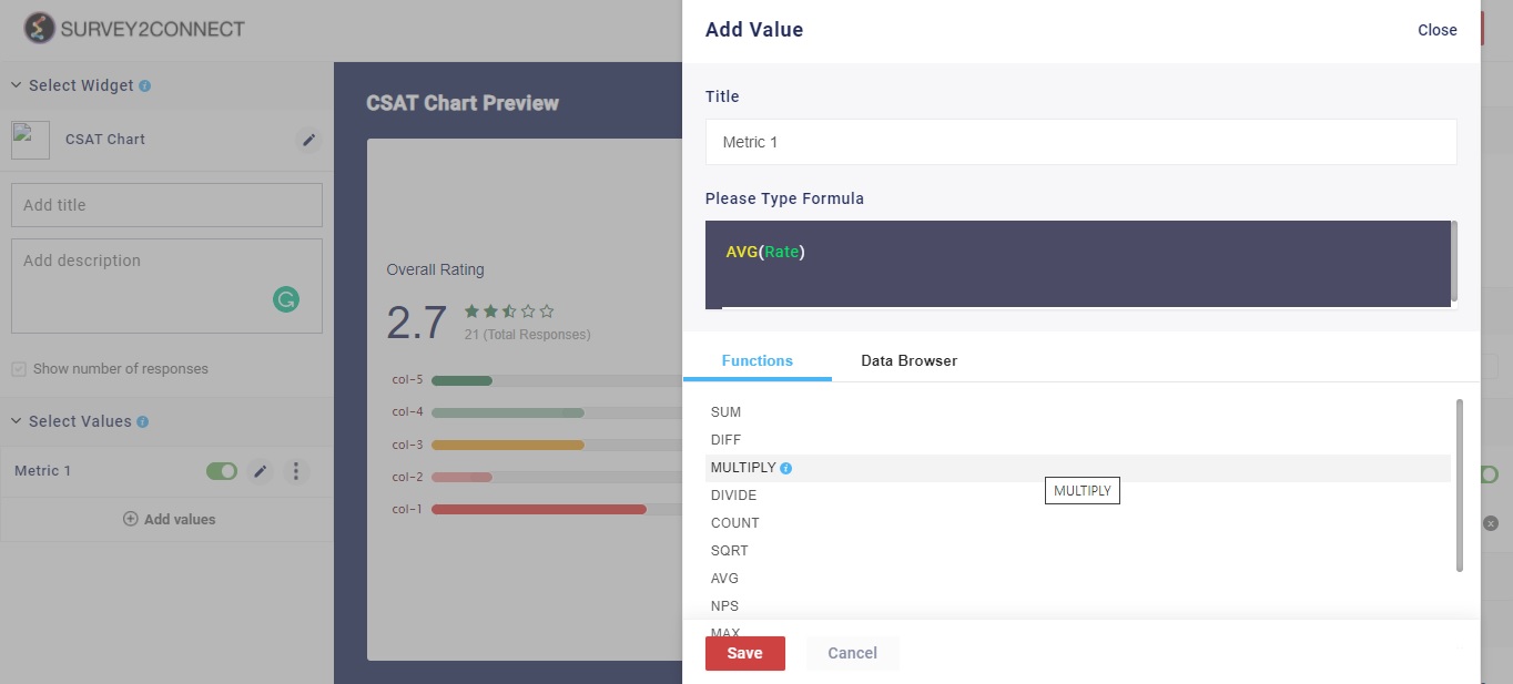
Select Value: This option lets you select the value for the chart. You can add multiple values to your chart. Users can select the question and function in this option:
-
- Function: This option lets you select the function, which acts as a mathematical equation for the data available. You can select from the options available.
- Data Browser: This option lets you select the question whose data would be used in the chart.
Sub-option of Select Value: There are minor customization options available under each Metric that you have added.
- Rename: This option lets you rename the Metric
- Delete: This option lets you delete the particular metric.
Designs: This option lets you manage the design of the Bar Chart. With Survey2Connect, you have the option to customize the designs of the widget. You can change the chart type, style, and design.
- Style: This option lets you change the chart type. The available options are — Circular Scale, Horizontal Scale and Numeric Scale.
- Theme: This option lets you change the theme of the NPS widget. You have an option to inherit the theme from the Dashboard page or select the 5 preset options available.
- Range and Color: You can assign a range to your scale and assign a different color to each range. This helps in easy reading of the scale. This option is only available if you have a circular scale selected as style.
Limit: You can set the maximum limit of the scale using this option.
Label: With this, you can manage the label of the data fields. These options help you customize the information shown regarding the data in the widget.
-
- Allow Overlap:
- Plot Color: This option lets you change the color of the needle or the score indicator depending upon the style used.
X-Axis: This option lets you manage the design for the X-axis.
-
- Label: You can change the color of the label data shown in the widget. This refers to the color of the text alongside the 5 individual scale indicators.
Others: This option lets you manage the addition widget settings. The available options are:
-
- Decimal Places: This option lets you select how many decimal places will be shown in the data
- Custom Colors: When enabled, you can assign a custom color palette to each individual 5 scores.